Recently updated: May 20th, 2026
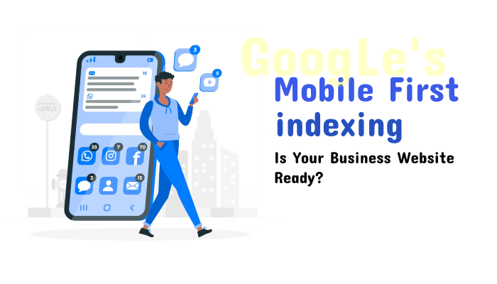
Google’s Mobile-First Indexing means how Google will rank and index different web pages on the basis of its mobile version. As the importance of mobile devices is growing rapidly, Google’s mobile-first indexing prioritizes the mobile version of websites for indexing and ranking. This strategy is used across all over the world.
Most of the sites shown in search results are good to go for mobile-first indexing, and around 70% of those shown in our search results have already shifted over.
However, many website owners find it challenging to optimize sites for mobile versions, s. In this comprehensive guide, we will explore mobile-first indexing updates, their implications for website owners, and best practices for adapting to this change.
What is Mobile-First Indexing?
Previously, Google used the desktop version of a website, where their system crawls pages from the site with the desktop and determines its relevance to a search query. But now Google web crawler is done indexing of mobile version first over its desktop version.
Almost 92.3% of internet users browse the web through their handy mobile phones. That is why Google shifted its focus to the mobile version first.
The main purpose of the mobile-first indexing updates is to shift fully to the optimized websites for mobile. Because of this change, all websites will first crawled by the Google bot which has a mobile version and you can see content according to that.
All ranking signals from page titles to internal links will be collected from the mobile version as well. So, your website’s mobile version will be a very important source of information about your domain for Google. Plus, it will also determine your rankings in search engine result pages (SERPs) as Google does not want to create separate databases for mobile and desktop.
How does Mobile-First Indexing Work?
Google’s Mobile-First Indexing evaluates websites that are being browsed on mobile devices for indexing and ranking. If a site has both mobile and desktop-optimized URLs, then the Google bot will crawl a URL that is optimized for mobile devices.
To optimize your website well, Google recommends using the same robot meta tags for desktop and mobile devices.
According to Google Algorithms, mobile-first indexing extracts the content from a mobile site when ranking its pages on the search engine result pages. This process ensures that users have the best experience when searching on mobile devices.
To acquire mobile-first indexing and high ranking, SEO professionals should ensure that their site is mobile-friendly and follow Google’s mobile-first indexing best practices.
How Mobile-First Indexing Works :
- Google bots will crawl websites to find new content. Once content is found, Google indexes it in its database. Later on, when a user searches for any query, it will allow it to appear in search result pages.
- Most websites have both mobile and desktop versions. In that case, mobile versions are designed well to provide a better user experience on smaller screens without any critical procedure, whereas desktop versions provide results on larger screens.
- Google algorithms evaluate a wide range of signals to determine the ranking of web pages in search results. These signals consist of page speed, content quality, mobile-adaptive, and many more. Desktop version content is used as a reference for cross-checking if required.
- It is important to emphasize that mobile-first indexing is not about having a separate mobile site but it is about ensuring that your website is responsive and mobile-friendly. Google is always looking at the user experience on mobile devices as a priority when determining rankings.
Impact of Mobile-First Indexing on SEO
Over 55% of website traffic comes from mobile devices. That is why website owners need to make the mobile version their priority for search engine ranking.
There are some of the ways through which mobile-first indexing impacts SEO.
- As we all know about mobile indexing, the process is not the same as in the past. Previously, Google primarily used a desktop version of the website to identify relevant answers for a search query. The mobile version is not only user-friendly but it also offers satisfaction and convenience. The mobile version is more important than the desktop version in terms of access to a business website.
- Google increased focus more on content rather than on links. Making web pages relevant to users on different devices is facilitated by mobile-first indexing. Websites that are optimized for mobile devices appear on top of search results.
- People who have business websites have the benefit of mobile-first indexing as it allows them to reach their audiences fast. It helps in focusing on connecting with their target market effectively.
In all aspects, mobile-first indexing is a significant change that businesses need to consider when optimizing their website for search engines as it prioritizes mobile-friendly pages.
Mobile-First Indexing Best Practices
Follow these best practices to make your website optimized for Google’s mobile-first indexing:
Make your website mobile-friendly and responsive
Whenever you are optimizing your website, start with a mobile-first design approach. You have to make sure that the mobile version of your website provides a good user experience. With responsive web design, it automatically adapts to multiple screen sizes and devices.
It will arrange elements, adjust differences, and hide unnecessary content. This will help your website look great and work well on every device.
So, instead of putting multiple URLs for mobile as well as for the desktop, select a responsive interface for your website and check if it’s responsive by seeing the demo page.
You can also check your theme using your mobile phone by visiting that web page. If the theme you are using is not mobile-friendly, then you might need to find a new mobile-friendly theme for your website.
Ensure Your Website Is Crawlable
Crawlability is one of the main aspects through which Google decides to rank your website’s content. So, you need to make sure that your website is crawlable. For this, Google should be able to find your pages, run your code, and assess your content easily without any confusion, especially on mobile phones.
To make your website crawlable and indexable, here are a few steps, that you need to follow:
- Always use structured data markup. This is a type of code that helps search engines understand your content.
- Try to avoid blocking resources like JavaScript, or images.
- Audit your website regularly to resolve issues.
For example: Let’s check your website’s Crawlability and Indexability through the Semrush site audit tool.
For checking crawlability:
- Start auditing your site by putting your domain name in the column and clicking on “Start Audit”
- Then, in the open interface, you can see the option for the “Issue” tab; click that.
- Go to the “Category” option and select “Crawlability”.
- Now, you will be able to see all the errors, warnings, and notices that are affecting your website’s crawlability
Then, check for indexability:
- Click on the “Category” option and select “Indexability”.
- You have a full report of indexability issues that your website is facing.
- Now, fix both issues accordingly.
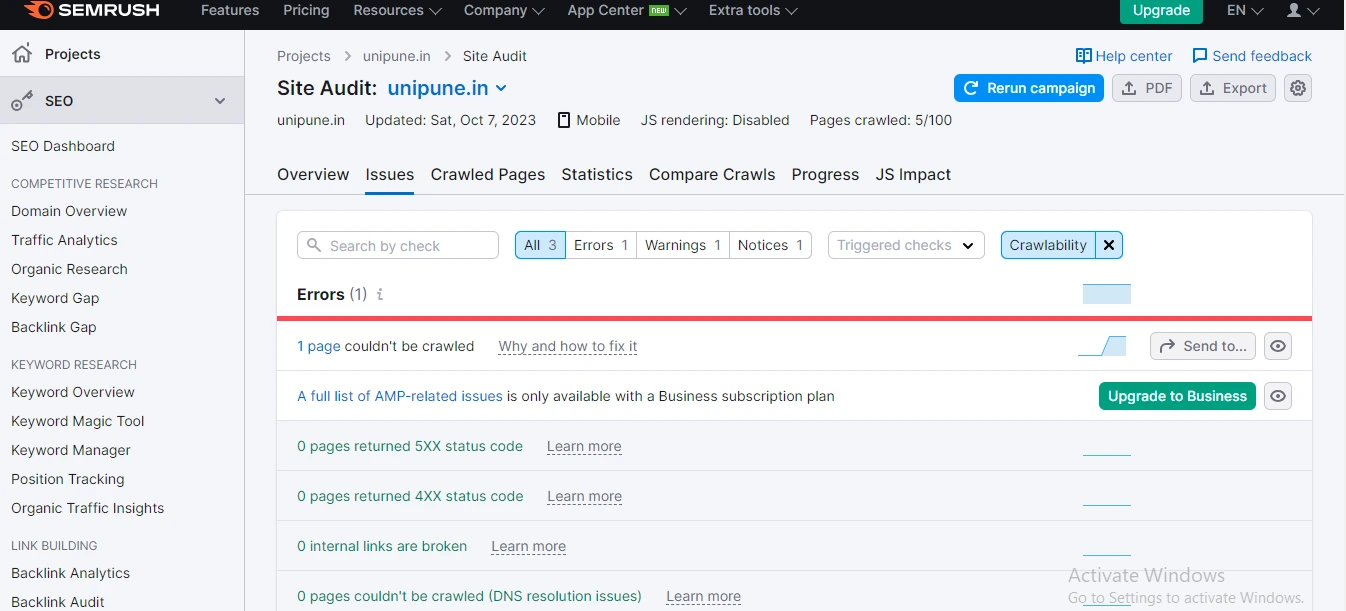
Source: Semrush
Optimize images for mobile & desktop version
Images are something that plays a very crucial role for almost every website and images can draw attention to your websites. That is why it is important to optimize all images and other forms of media for all devices especially on mobile phones as Google is fully inclined towards mobile-first indexing.
For optimizing images for mobiles, you need to follow a few guidelines:
- Try to use high-quality images and the most relevant images that match your content. But before using them, compress them; to decrease page load times.
- Give an image sitemap that helps search engines find and index your images.
- Provide a video sitemap, a form of a file that helps search engines find and index your videos.
- Use structured data for different media forms that help search engines understand your content
- Avoid loading images to improve website speed and interface.
By following these steps, you will be able to create a better user experience and improve performance for both mobile and desktop versions.
Mobile-First Indexing Issues and Solutions
Mobile-First Indexing is a technical process done by major search engines like Google, to primarily use the mobile version of a website’s content for ranking and indexing in search results. This means that when determining a website’s position in search results, search engines give a more important mobile version of the website’s content.
The main reason for this shift in focus is driven by the fact that more people use mobile devices to access the internet, so it makes complete sense for search engines to prioritize mobile-friendly content first.
Mobile-First Indexing can lead to various issues and challenges for website owners, but to tackle all those issues, some effective solutions are also there.
Issues and Solutions to Optimize for Mobile-First Indexing
- Having slow speed of websites on mobile devices: If your website usually takes a longer time to load, it can lead to a poor user experience and may become the reason for not performing well in search engine rankings since Google prioritizes mobile performance.
The solution for this problem is: You need to optimize your website performance for multiple devices to improve the user experience and rankings in search engines. You can compress images, start using a content delivery network (CND), and minimize the code.
- Being inconsistent with your content on mobile phones and desktops can create confusion among consumers and create problems for Google to index and rank websites accurately.
The solution for this problem is: You have to make sure that the content on both versions of mobile and desktop are the same, which will avoid confusion for users and make it easy for Google to index and rank your website accordingly. To maintain this process, try to adopt a responsive design.
- Sometimes, Google encounters blocked resources like JavaScript on the mobile website. This will become a hurdle for Google to identify webpages properly and cannot find relevant pages for the search query.
To solve this issue, you have to make sure that all resources such as CSS files, images, and videos are easily accessible to the bot of Google. This will avoid rendering issues, confusion, and negative impacts on your website’s ranking. You can use the “Fetch and Render” tool of Google Search Console to check for blocked resources.
- A website that fails to provide a good user experience due to unresponsive design and usability issues may not rank as well in search results on mobile as Google prioritizes mobile versions.
To tackle this issue, you have to optimize your website’s user experience for multiple devices to improve search engine rankings. You can achieve it by using responsive design, optimizing all images, having relevant content, and simplifying navigation.
How to Implement Mobile Site?
There are three ways through which you can design your website for mobile devices.
Web Design
Make your website interface responsive because it is easy to implement, optimize, and maintain it time to time. It is also recommended and prioritized by Google. As it requires less optimization, you can opt to implement this design for your website by setting it up properly. With mobile design, the HTML code and URL remain the same as for the desktop page, and the content adapts automatically for different screen sizes of the device.
Optimized page speed
Page speed plays an important role in creating the first impression of any website. About, 47% of visitors abandon a website if it takes more than 2 seconds to load.
According to Google, high speed is a positive ranking factor for your website. So, develop your website by taking all necessary steps to increase website speed. You can evaluate your website speed test on different tools available online such as BrowserStack and SpeedLab. Enter your website URL and start verifying your website speed.
Avoid using separate URLs
Avoid using separate URLs of your website for mobile and desktop along with codes. Check your robots.txt file, whether it works for both sites and pay attention to link tags and how they are set up.
Adjust and rectify the error pages so that they would work the same on both sites.
However, websites that serve different codes or URLs are much more responsible for experiencing issues or errors, and maintaining them properly becomes difficult.
Incorporate appropriate viewport Meta tags
Incorporating the Viewport Meta tag helps you control the viewport’s width and scaling so that the website fits all and is sized correctly on all devices. These tags instruct the browser to resize the web page according to the screen size of the device automatically.
Best Tool for Evaluating Mobile Indexing
There are many tools available in the market for evaluating your website for mobile indexing. Google Search Console is one of the most prominent and famous tools for evaluating mobile indexing.
When it comes to mobile-first indexing, Google Search Console is the perfect tool that will give you an overall understanding of your website. It helps in providing important insights in addition to monitoring and parallelly discussing the issues including Google penalties, security failure, mobile usability, and other major things that impact search visibility. It will check URLs from its most recent crawling through the URL inspection tool.
It also offers functions for managing incoming links, demographic targeting, and language-specific issues.
With the introduction of mobile-first indexing, Google has changed its ranking and indexing process. By following best practices for mobile-first indexing, you can easily rank your website high in search engine result pages.
Conclusion
Google’s Mobile-First Indexing reflects the website owner’s commitment to providing a better search experience for mobile users. As the majority of internet traffic now comes from mobile devices, companies need to adopt this significant change.
By following the appropriate practices above, you can ensure that your website remains competitive in Google’s search results. Simply make your website mobile-friendly while maintaining its page speed and providing a seamless user experience. It will improve your website rankings and enhance the overall satisfaction of your visitors.
Stay updated with the latest changes and with different versions for attaining the position in the market.
Hopefully, this guide helps you with all the required information and clears your doubts.


