Dhirendra Kumar
Dhirendra Pandey is the Co-Founder & CEO of Media Search Group. He has been working in the Digital Marketing industry more than 10+years.

Recently updated: October 31st, 2019
Having just a regular HTML and CSS website is not enough these days. What you need is a creative, sophisticated website that compels your visitors to engage and explore your brand. Your visitors should receive the message inherently you want to communicate through your website without them even realizing it.But, when your website design seems as old as that of 90s’ websites or not visually attractive, it takes no time for a visitor to switch to another website. Why? Because people have thousands of options and if you don’t give your visitors any reason to stick with you, they are not going to stay on your page.
So, believe it or not, the appearance of your website matters a lot. If you want to stand out amidst your competitors, you need to address the surging demand for improvements while taking factors like responsiveness, optimization, and flexibility under consideration.
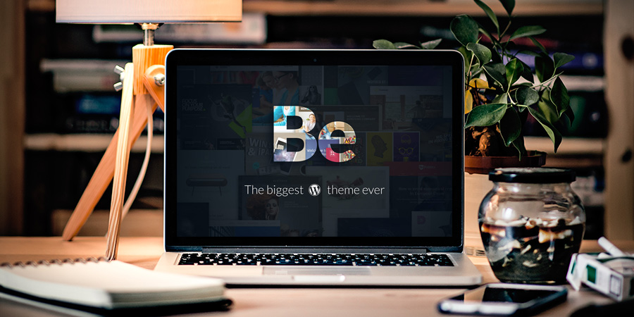
Fortunately, meeting these challenges is not difficult as there are tools readily available in the market. One such tool is Theme Forest – the most versatile and popular WordPress theme. All you need is to exploit its collection of dramatic and attractive themes to your advantage by following five simple tips that we are going to share ahead. Once you understand the gist of these tips, we can guarantee that your clients will leave with happy faces after visiting your website.
The color palette of your website can create a world of difference in your website’s appearance. This is the most dominating part of your website’s page and instantly makes an impact on your visitor’s mind. So, choose colors that:
Grab the attention right away
Support your brand and culture
Seem in harmony with the message you want to convey
Let’s understand this through some examples.
1. Just observe how Artist use BOLD color touches without making the experience overwhelming. Certainly, this presentation immediately grabs the attention of users.
2. becreative is another example of Be Theme’s pre-built website. Take a look at how two eye-catching colors are blending and transitioning without making boundary distinct.
3. Carbon8 is a great example of how one can align the color palette to support the message and brand collectively. Just the subtle use of various green shades is making the page intriguing and the deep green is unfailingly bringing the attention to the center of the page.
4. This BeInsurance’ website is a clear demonstration of how to use crisp colors with finesse by reinforcing the strategy of using clear, high-resolution images to attract clients you are looking for.
5. This BeFestival page explains how to use several colors without distracting and how to target the larger audience without saying explicitly.
Remember that “your website reflects what you are”. Putting ultra quality images and photos on your website reflects the idea that you go the extra mile ahead when it comes to pleasing your audience. So, don’t compromise with the image quality, especially when you present your products and services. Ensure using the best images incorporated with some creativity to get an edge over the stiff competition.
Observe how websites in the below examples are enchanting their audience without saying anything.
1. BeStylist is a great example of displaying images with elegance. It finely represents how your images can support your brand’s message with subtlety.
2. Looking for a minimal design? This RansomLTD stands tall on the expectations when one wants a website to be minimalist, yet powerful and stimulating.
3. This pre-built website, Zajno, displays the creative use of pics with sheer clarity.
4. Or, you can try something like The Design Shop which makes use of a crisp and captivating image with a touch of flair and creativity.
The sole purpose of creativity is to serve your visitors, not you. With this virtual tool, you let your visitors imagine themselves actually benefiting from your products or services. When they visualize themselves using what you offer, it cultivates the urges deep inside them.
For instance,
1. This BeMarketing’s home page illustrates the audience what they can gain by using your products.
2. Check how Lane is incorporating a fantastic strategy of displaying your structural design aspects.
3. BeSimple features how typography and presentation of text can be more effective than the text itself.
4. BeTravelBlogger is the perfect way of presenting how a dream site of a travel blogger can entrance the readers. You can employ this theme to display pics that tell your tales and experiences of traveling with the amazing layout of graphics and snippets.
It’s true. People get never tired of white space as long as it is cleverly used. White space is a design tactic which can be overused sometimes without any worries. In fact, you can follow “the more, the better” in some cases.
See how white space silently blends with other elements in the following examples.
1. The design of makespace is an ideal example of how white space can be used to gather focus on key elements.
2. Other fabulous examples where white space is used in plenty are BeSketch and The Drive New York.
3. What can be a great opportunity to use white space when it is a part of the brand? BeIcecream is an excellent demonstration of how white space can create a massive impact on the users’ minds.
Have you ever noticed that most people desire to buy a dress that is put on the mannequin even when there are hundreds of dresses in the store? It is the natural instinct of humans. Whatever is highlighted attracts them the most. So, have CTA buttons that cannot be ignored. If CTA buttons are not attention-grabbing, your website isn’t going to transform your visitors into users and potential customers as you expect.
Make CTA buttons big, bright, and bold enough that stir up the feelings in visitors to click these buttons. CTAs should make them curious to know what’s behind.
1. You can notice the outstanding CTA button in BeDrawing’s pre-built website. Visitors will instantly notice it right after reading the heading. Plus, its central position on the page entices people to enter your world.
2. Assess the strategic placement of 3 clearly defined CTA buttons in Stuart’s home page.
3. Another fine example of this is the BeKids. Its color-scheme matches the color of CTA buttons and still, it appears attractive and eye-catching.
The development of a creative website doesn’t have to be a headache. By following these sure-fire tips with the help of the latest BeTheme tools, you can satisfy even the most demanding clients. All you need to keep in mind is:
Choose a visually attractive color palette that blends with the theme and support brand perfectly
Put crisp, crystal-clear, and stunning images that deliver your brand’s message and help visitors to imagine themselves using your products
Use white space sagaciously
Make all important CTA buttons clearly visible and bright so that they instantly grab visitor’s attention
Don’t forget to show how your creativity is beneficial to them.
The combination of all these tips is a ladder to build an outstanding website successfully. Whenever you find yourself struggling in website development projects and deadlines, shift to pre-built websites. There are lots of creative websites on theme forest that you can customize as per your preferences. So, start exploring its gallery right away and it will eliminate all your worries about deadlines and projects’ delivery.
Top 4 Online Proofreading Tools for Precise and Error-Free Writing - June 4, 2024
10 Best Ways to Leverage Content Marketing for Startups - June 1, 2024