Mobile SEO 2018, Consider the everyday scenario, when you have a query in mind. The sole source of help for all sorts of questions is undoubtedly the internet. Whether it is booking a hotel online or making a reservation in the train, whether it is reading a book or connecting with people, whether it is comparing brands to make an online purchase or find directions to a specific location, the internet always comes to our rescue.
Then, how can you forget that all other users do the same! And amongst those ‘all others’ are your potential clients, who turn to the internet, whenever they need. Your being online is increasing the possibility of your being discovered by new clients every single minute.
But halt. What devices are used every minute to access the internet and to access millions of websites? How do people conveniently perform their searches? How do they choose the most reliable result from the search results? And how do the websites rank in the top search results?
This brings to light the fact that 80% of internet users own a smartphone and access the internet through it only. The common answer to all the above said questions is the increasing use of mobile devices that have made it mandatory for all websites to have the AMP feature incorporated in their design, if and only if, they want to rank to the top of the mobile-first indexing of Google.
Mobile SEO 2018
Google has created and is operating separate algorithms for the searches taking place on mobile devices. These are totally different from the algorithms that run on the desktop searches and have therefore made 2018 the year of mobile SEO. This might just be your number one priority because if you want to appear in the mobile searches, which are nearly 80% of all searches performed every minute, you need to change with the changes.

What is a mobile-friendly site?
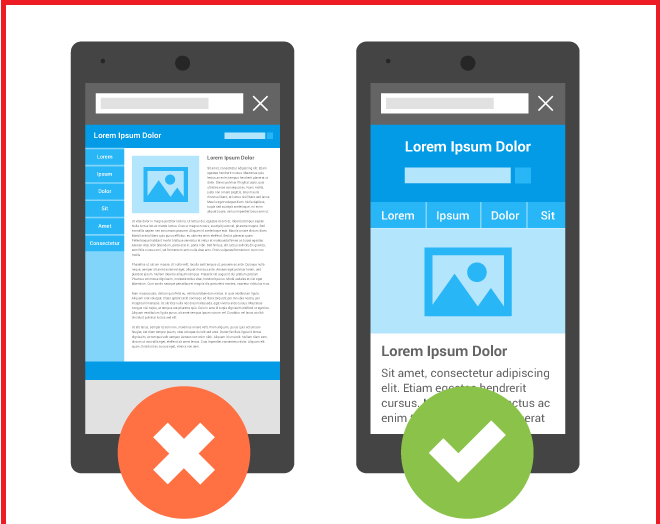
A mobile-friendly site is one whose performance has been improved in such a way that it offers the users an excellent mobile experience. In simple words, a website, which when accessed through the mobile devices, should be very compatible and smooth.
What are the features of a mobile-friendly site?
A mobile-friendly site loads properly on a mobile device like a smartphone or tablet, and that too in a lighting fast speed. It has the presentation of the content in a readable formatting, without requiring the users to pinch and zoom the site. It offers ample room to navigate by touch, from one page to another on the same website, by simple clicks. Thus, it has totally different features that make it understandable for the search engines that it would retain their users and hence up value your site in search results.
Why is there a need for mobile SEO?
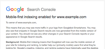
The internet world has most of the users using Google as their primary search engine. According to Google Analytics, most of its searches are performed through mobile devices, and hence it required responsive websites. Now, just being responsive is not sufficient because the mobile version of the site is being marked as criteria to determine rankings this year. Mobile SEO is necessary to achieve the rankings in the mobile-first indexing of Google, and hence, mobile search results.
How to create your mobile-friendly site?
- The very first metric that helps your site to be mobile friendly is it’s being responsive, that is, it must adjust all its contents according to the screen size of the mobile devices, which are relatively very small from the desktop screen size.
- The second metric that comes in mobile SEO is needed for speed. The bounce back rates are so very high that no user takes a moment of thought before clicking the back button when accessing a site through the mobile phone. You can optimize your images and do browser caching for better loading speeds.
- The third metric is minimalistic or no use of interstitial advertisements and pop-up advertisements. These hinder the user experience and therefore, are negative points for mobile SEO.
- The fourth and very important metric is reduced use of redirects. Users on mobile devices love to see the content that opens as soon as they click on it, on the very same page. These redirects not only make the site slow but also test user’s patience. Therefore, direct links must be used as far as possible.
- The fifth metric is an easy user interface. Large tap buttons that make navigation easy and natural must be always used. Besides this, the user must have plenty of options in the menu bar and footer to navigate to various points on the site.
How having a mobile site impacts conversion?
A recent survey by Google underlines the damage that you might be doing to your brand by not having your website optimized for mobile. If you are in the business of e-commerce, you would definitely wish to earn maximum money in minimum time, and generating sales through mobile searches is the call of the day.
The shoppers are more likely to be interested in your product or service if your site is optimized for mobile. Once a user becomes your customer owing to the good experience he or she has on the mobile site, they are more likely to return.
Not just this, if you have a good brand reputation, not having a mobile site will drastically damage your brand value and make people less likely to engage with a company in the future.
What is the best solution?
As of now, when top 80% sites in the Alexa ranking were mobile friendly, it is but obvious that there is a cut-throat competition in the world of mobile SEO and your site needs to be optimized for mobile. There are two possible scenarios – either ask your developers to construct the mobile-friendly site according to the guidelines mentioned above or tell them to work on the Google AMPs (Accelerated Mobile Pages). While the former sounds profitable, the future is all about AMPs.

Convinced?
If you are not yet convinced that 2018 is the year for concentrating all your efforts on mobile SEO of your existing or new site, then we have a few statistics to give you a better idea.
In the year 2016, 51% of all digital ad budgets were spent on mobile marketing strategies, to acquire mobile users. This implies that you have marketers and advertisers heavily investing in mobile, increasing your competition.
By the year 2019, mobile advertising is expected to represent 72% of all U.S. digital ad spending but at the same time, 70% of people report disliking mobile ads. This implies that users will access the internet through mobile devices but will not click on ads, increasing the need for mobile sites.
In our year 2018, the internet users are expected to spend on an average 3 hours and 23 minutes on nonvoice mobile media. This implies that the users are going to invest their 3.5 hours in either reading on the web, listening to podcasts, viewing infographics, watching videos or shopping online.
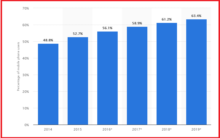
By the end of 2018, the number of smartphones sold and the active users on smartphones will rise tremendously, expanding the audience for mobile searches and hence, conversions. It is good news for companies with a mobile marketing strategy but a bad news for the ones who are not yet decided on a mobile-friendly site.
According to the surveys, 48% of consumers start mobile research with a search engine but 33% go directly to the site they want, because of the UX the sites provide. This shows the need to produce valuable content and to offer great user experience for mobile searches.
Last but not the least, you should be aware that Google drives 96% of mobile search traffic, followed by Yahoo at 2% and Bing at 1%. This implies that incorporating AMPs is more than a necessity now. If you want to increase your mobile search traffic, optimize for Google searches with squeezed titles and URLs, and careful meta-descriptions.
Conclusion
Gone are the days when people used to download the Apps of services to gain benefits from them. More and more users now prefer to directly go to a website that displays in the top search results, not going by anything else but the brand authority that Google shows to them.
Over 50% of smartphone users grab their smartphone immediately after waking up, maybe to check their emails or their messages or their social media feeds. But, this brings to light the excellent opportunity to grab their attention while scrolling and divert them to your mobile site.
A poor mobile appearance can make your business look unprofessional and out of touch with the modern consumer. Right impression requires you to optimize your site for mobile searches and mobile uses. This is now a core part of all businesses as very less is known and very large is possible.
At the same time when you lose a customer, your competitor gains one. So, provide a better mobile experience and prevent this worst-case scenario.
